Editor's Note: This story is an excerpt from a feature in RLD's fall 2019 issue. Go here to read about other dealership remodeling stories.
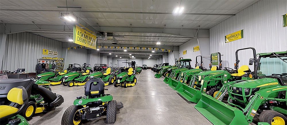
In July 2018, Josh and Mandy Witt purchased a John Deere dealership in Marshfield, Wis., Power Pac Equipment & Motorsports. The dealership already had a large showroom, but the Witts knew some work was needed to bring it more up to date. Additionally, they had big plans to grow the business. They wanted to display at least one of every equipment model they carried. They also wanted to make any necessary facility enhancements to help them continue growing.
Soon after taking ownership of the business, the Witts began remodeling the existing 10,000-square-foot showroom. They also started construction of a 10,000-square-foot showroom addition.
“The previous owner was already talking with contractors about a showroom expansion. We wrapped all of that into our plans to purchase the business when we applied for a business loan,” says Mandy Witt, co-owner and chief marketing officer of Power Pac.
In expanding and updating the showroom, the Witts wanted to find a way to separate the two primary components of their business: powersports and lawn and garden. Mandy says this would be received positively by both consumers and manufacturers. “The OEMs like to see their brands separated from some of the typical dealership noise,” Witt says.

Mandy Witt redesigned the company logo to give it a more modern feel soon after she and her husband, Josh, purchased Power Pac Equipment & Motorsports. The new logo is now being incorporated strongly into the dealership’s revamped showroom. Photo courtesy of Power Pac Equipment & Motorsports.
Much of that “noise” includes the mishmashing of product types and brands in the same display area, as well as signage plastering the walls and counters. “Before you know it, your dealership can end up looking like the side of a race car,” she says.
The Witts set out to establish distinct showroom sections by product type. “That way, if a customer is shopping for a riding mower, they don’t have to walk through rows of ATVs,” Witt says. Each section is organized by OEM to further improve the shopping experience.
The Witts also kept customer traffic in mind when laying out the new showroom. “When a customer walks into our remodeled store, the first thing they see is motorsports because it is exciting — and we want to project a fun, adventurous feel. But we also need a lawn and garden section, and everything has to feel like it’s the same company. We want the customer’s first impression to be Power Pac, whether they are looking for adventure or to get work done,” Mandy explains.

Motorsports and lawn and garden are displayed separately in the new Power Pac showroom. To further improve the shopping experience, each section is organized by manufacturer. Pictured is the STIHL display in the lawn and garden section. Photo courtesy of Power Pac Equipment & Motorsports.
Once the showroom addition was built, the Witts set out to create a cohesive look. A new color pallet based on neutral grays was selected. “This provides a more modern feel that can grow with us without becoming dated,” Mandy points out. They also updated the flooring with modern carpet tiles and a similar color scheme. The main storefront sign was updated with the new color scheme and new company logo.
That logo was one of the first things Mandy jumped on when she and her husband bought the dealership. “With my marketing agency background, I kind of ‘nerd out’ on projects like this,” she says.
Mandy involved the dealership staff in the logo recreation. “We did some branding exercises. We talked about what we were good at and what we wanted people to think about when they stepped into our store. Words came up like adventurous, down-to-earth and approachable. That’s what we wanted to incorporate into our new brand,” Will says.
Related content:


